Feedback drifts away from the screen.
The moment it moves to screenshots and chat, it's hard to remember exactly what you were talking about.



May 29: We've added 3 new solution pages
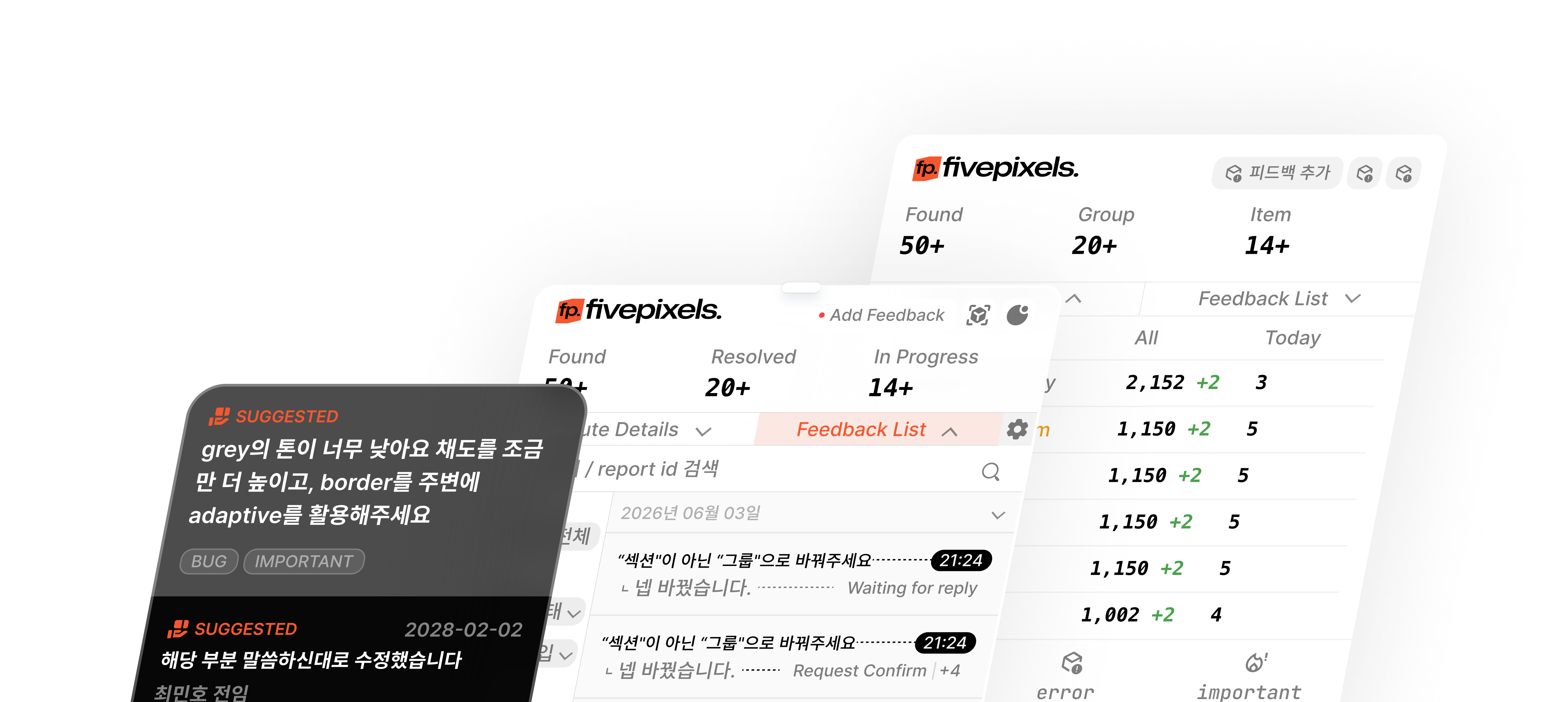
Leave feedback right on the screen you're reviewing.
Start light pin it where you click, and escalate to an issue only when you need to.
The QA tool you adopted to help the team
becomes the bottleneck—and adoption gets abandoned
The moment it moves to screenshots and chat, it's hard to remember exactly what you were talking about.
Without markers, every review round starts with finding it again and explaining it again.
When adoption looks like a big project, the review flow you actually need keeps slipping to the next release.
One comment on the product screen lands faster than a long annotated message thread.
Start on the same review screen your team already shares.
Instead of a messenger thread, pin comments right where you clicked.
Replies, status changes, and re-review stay in one flow.
@Mark The Slack design in the UiEditSection.tsx message area is a mess. I sent a screenshot.
I checked the screenshot, but I can't find what needs to be fixed.
Build a Slack-style skeleton like the screenshot and just swap the content.
Point me to the exact spot and I'll fix it right away.
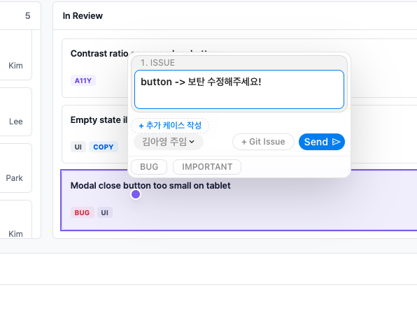
Leave it on the element—no more explaining which one
Reopen the page and the same spot is recognized automatically
Review and discuss without switching apps
Replies, confirmations, and resolutions in one flow
Adjust text, spacing, color, alignment, and more on screen
See before and after states at a glance
Move from verbal explanations to visual agreement
No vague feedback—just actionable changes
Attach to your current screen—no separate QA SaaS
Leave and view modes—anyone can start right away
Mount it on a React app in half a day
Clients can join reviews quickly via /guides/client
Independent styling without host CSS interference
Try it in the browser with no backend
Tag only what you need with data-report-id—no full-app tagging
Limit exposure before production with `visibility.devOnly`
Use it personally without an API or server
Leave comments right on the screen and find the same spot again later.
Start light by adding data-report-id to just one high-traffic review page.
Use devOnly on internal and staging environments—keep it off live.
1// 1) Install2npm install @fivepixels-js/react react react-dom34// 2) Mount once at the app root5<FivePixels6 project={{ id: "my-app" }}7 visibility={{ devOnly: true }}8/>910// 3) Only on elements you want (optional)11<button data-report-id="hero-cta">12 Get started13</button>Founders, PMs, and designers review directly—and feedback scatters across verbal updates.
Tools exist but rules don't, so the same issue gets explained again across channels.
When clients say "just a small tweak," you want to pin it right on the screen.
Learning a new QA app and onboarding feels bigger than shipping itself.
No. It helps you leave precise feedback, confirm it, and hand off into the issue flow your team already uses.
Yes. Because feedback stays on the product screen they are already viewing, it feels natural on staging reviews.
Not necessarily. Start with the localStorage flow, then connect handlers when you need shared persistence.
We aim for a small start: install, mount once, and tag one high-traffic review area.
fivepixels is free and open source. Rather than learning yet another QA SaaS,
we add a thin review layer on top of the product screen you already use.