

WHY TEAMS SWITCH
You do not have to explain which button again.
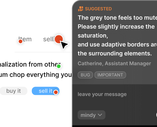
Pinned markers preserve the exact spot, so the next review starts with context intact.
GitHub Copilot App
No heavy QA platform required. Leave feedback on the screen being reviewed, align with the team, and turn it into an issue only when needed.
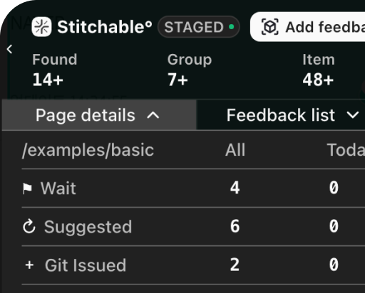
Designed to sit lightly on top of React and expand only to the surfaces that need review.
RUN REVIEW ACROSS EVERY AREA OF WORK
Large demo surfaces and short supporting cells keep the page readable even when more product detail is added.
Parallel workflows, fully in view
Each section is narrowed to one clear message, with structure coming from lines and cells instead of decoration.
Sessions
EXTEND AGENTS WITH YOUR OWN TOOLS
The layout now leans on squared cells and thin dividers so the information feels tighter and more deliberate.
WHY TEAMS SWITCH
Pinned markers preserve the exact spot, so the next review starts with context intact.
FOR STAKEHOLDERS
Share the staging URL and leave feedback directly on the product surface people are already seeing.
FOR DEVELOPERS
The main advantage is starting small and only expanding where review density is high.
For developers
With default Mona Sans spacing and a squared grid, the setup cost and technical rationale read clearly at a glance.
Install the package, mount once at the app root, and start from a single staging page.
Tag only the screens that need review first with focused `data-report-id` coverage.
The feedback UI stays isolated from host styles, so it drops in without CSS conflicts.
You can experience the full local flow before connecting a shared handler.
Keep it out of production and available only in staging or internal environments.
npm install @fivepixels-js/react react react-dom

<FivePixels
  project={{ id: "my-app" }}
  visibility={{ devOnly: true }}
/>

<button data-report-id="hero-cta">
  Get started
</button>
DAY 0
Install and mount once
DAY 1
Start with one high-review page
DAY 2+
Connect handlers and team rules
PLANS
Instead of abstract product language, the comparison shows what changes in a way people can scan immediately.
Share your feedback
Whether you find a bug or have an idea for a feature, we want to hear from you. Let us know and we'll take your ideas into account.